Rock music, born from the rebellious spirit of blues, country, and electric innovation, has always been more than just a genre; it’s a cultural phenomenon. From the experimental 40s and 60s to today’s diverse sounds, rock embodies subversion and a liberal attitude that resonates deeply with fans. Iconic rock bands are not only musical pioneers but also visual artists, influencing trends in music, fashion, and graphic design. Their logos are instantly recognizable symbols, representing their music, ethos, and legacy.
Often misunderstood in their early days, rock bands are now recognized as masters of visual branding. Whether you’re a die-hard metalhead, an indie enthusiast, or a casual listener, you’re sure to recognize many of these legendary Rock Band Logos. These symbols have become famous for a reason: they are powerful representations of the bands they represent.
For aspiring musicians, understanding the impact of a strong visual identity is crucial. Looking at successful rock band logos can provide invaluable inspiration for crafting a logo that will become the face of your music career. History often repeats itself, and in design, learning from the best is the surest path to creating something truly impactful.
This guide explores some of the most astounding rock band logos, spanning from the 20th century to contemporary bands still topping the charts. Consider this your inspiration and guide to understanding what makes a rock band logo truly iconic.
Rolling Stones
The iconic tongue and lips logo of the Rolling Stones, designed by John Pasche, was commissioned by Mick Jagger in 1969 for a mere £50 (approximately £829 today). Pasche, then a student at the Royal College of Art in London, drew inspiration from Jagger’s prominent lips and pop art aesthetics.
This bold and colorful logo perfectly captured the band’s anti-establishment attitude and became a symbol of rock and roll rebellion.
Pink Floyd
![]() Pink Floyd prism logo
Pink Floyd prism logo
Synonymous with Pink Floyd’s groundbreaking album, The Dark Side of the Moon, the prism logo is instantly recognizable. This album, one of the best-selling in rock history, features a design of light refracting through a prism.
Designed by Storm Thorgerson, a graphic designer and childhood friend of band members Syd Barrett and Roger Waters, the physics textbook-inspired logo cleverly references the elaborate light shows that became a hallmark of Pink Floyd’s live performances.
Red Hot Chili Peppers
In a rush to create a symbol for their record label, Red Hot Chili Peppers’ frontman Anthony Kiedis quickly sketched an asterisk. Kiedis humorously refers to his creation as “The Angel’s A-hole.” The logo is often accompanied by the band’s name in Franklin Gothic font, a bold sans-serif typeface.
The band’s DIY approach to their logo reflects the raw and energetic spirit of their music. For bands looking to create their own unique visual identity, a rock band logo maker can be a valuable tool for experimentation and inspiration.
Metallica
![]() Metallica logo typography
Metallica logo typography
Believe it or not, Metallica’s sharp and angular typography logo first appeared on the band’s business cards in the 1980s. Even rock legends understand the importance of professional branding.
Designed by lead vocalist James Hetfield, the logo utilizes a custom font reminiscent of “Pastor Of Muppets.” This demonstrates the multifaceted talents within rock bands and has become one of the most recognizable visual identities in music.
Daft Punk
The French electronic music duo, Daft Punk, features a sleek and stylized logo that has adorned their albums and even made appearances at events like the Monaco Grand Prix. Guy-Manuel de Homem-Christo, one half of the duo, designed the logo himself, drawing inspiration from a poster for the 1981 film Thief.
Muse
![]() Muse text logo
Muse text logo
Muse employs a straightforward and modern text-based logo using Frutiger 65 Bold font. This English rock band’s logo is often presented with or without enclosing lines, maintaining a clean and contemporary aesthetic.
Oasis
Oasis, one of Manchester’s most celebrated bands, is often represented by a simple yet impactful logo featuring their name in a rectangular frame. This famous logo is set in Helvetica Black Oblique font in lowercase, projecting a cool and understated image.
AC/DC
![]() AC/DC lightning bolt logo
AC/DC lightning bolt logo
Reflecting their high-voltage energy, AC/DC’s logo is infused with electricity. The font, called Squealer, has a geometric and edgy style, further emphasized by a lightning bolt illustration that dynamically separates “AC” and “DC.”
Linkin Park
While Linkin Park has evolved their logo over time, their most iconic design remains a circular initial logo incorporating the letters “L” and “P.” The typography is rigid and angular, devoid of curves, conveying strength and resilience.
In a more recent redesign in 2017, Linkin Park adopted a hexagon logo with a missing edge as a tribute to their late frontman. This symbolizes the band’s six members and their enduring legacy.
The Ramones
![]() The Ramones presidential seal logo
The Ramones presidential seal logo
Legend has it that The Ramones sold more t-shirts featuring their logo than albums. Their emblem, designed by Arturo Vega, features a modified presidential seal with an eagle holding an apple tree branch and a baseball bat in its talons.
Vega, considered the “fifth Ramone,” envisioned the band as quintessentially American. His design became a cornerstone of the band’s visual identity, reflecting their raw and energetic punk rock sound.
Blur
Blur, another prominent English band, utilizes a tightly knit text-based logo. The characters are connected without spacing, creating a solid and unified silhouette. This logo is commonly seen in black or white, offering versatility and impact.
Paramore
 Paramore bars logo
Paramore primarily used a text-based logo for much of their career. However, they now feature an emblem with three bars, each symbolizing a band member. Variations include flat and optical illusion versions of this rectangular logo, showcasing adaptability and modern design sensibilities.
Buzzcocks
In 1977, punk band Buzzcocks collaborated with Malcolm Garrett, an art student. Garrett’s Buzzcocks wordmark became his first professional project. Utilizing Compacta font, he creatively overlapped the two “Z” letters to resemble a striking bolt of lightning, perfectly capturing the band’s energetic sound.
Bon Jovi
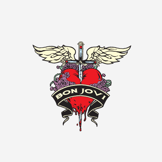 Bon Jovi dagger heart logo
Bon Jovi’s dagger through the heart logo is incredibly fitting for this classic rock band. This New Jersey band’s logo incorporates a powerful color scheme, achieving balance despite the detailed illustration, symbolizing both romance and rock intensity.
Depeche Mode
As pioneers of electronic music, Depeche Mode’s logo has a punk-inspired black and white aesthetic. Since their formation in 1980, their logos have consistently featured a raw, handwritten style, projecting an edgy and unconventional image.
Aerosmith
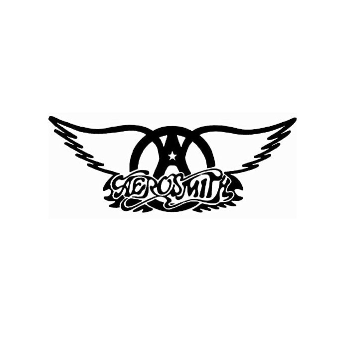 Aerosmith wings logo
Aerosmith’s winged logo is a timeless emblem of 80s rock. Former guitarist Ray Tabano designed the wing logo, which first appeared on their Get Your Wings album, becoming an enduring symbol of the band’s soaring sound and stage presence.
The Beatles
The Beatles’ “Drop-T” logo, famous for its asymmetrical design, instantly grabs attention. The letter “B” dramatically towers over the other characters, while the central “T” appears to hang lower, creating a unique visual rhythm.
Ivor Arbiter, a drum designer, customized this font on the fly to decorate the band’s drum kit. This quickly became an iconic and recognizable symbol for the band.
Nirvana
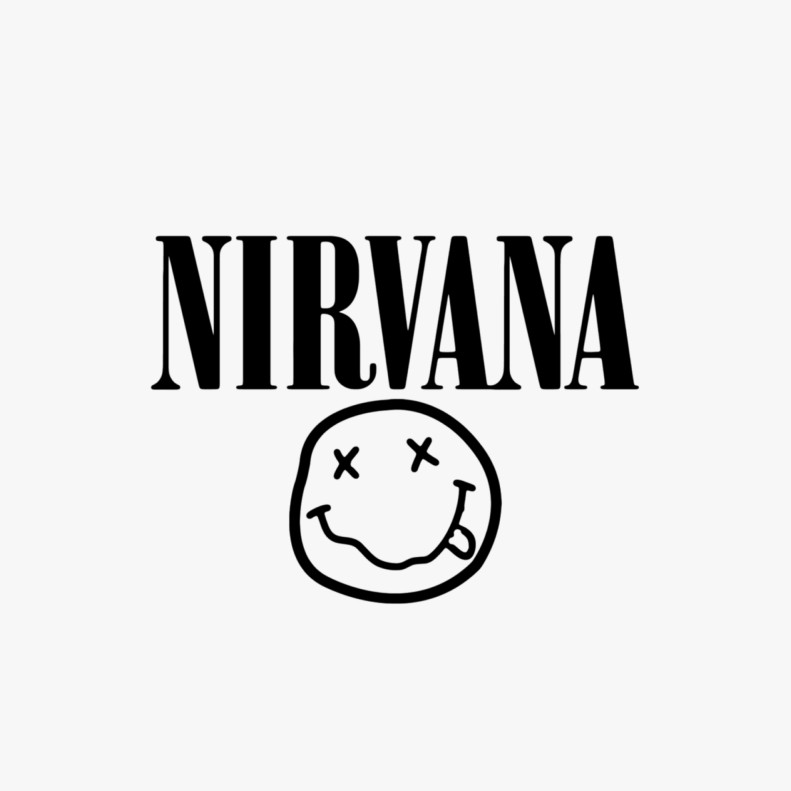 Nirvana smiley face logo
Before becoming a staple on alternative music fans’ t-shirts, Nirvana’s X-Eyed Smiley Face first appeared on invitations for their Nevermind album release party.
Rumored to be drawn by Kurt Cobain himself, this endearing yet slightly unsettling smiley face, paired with Nirvana’s wordmark in Poster Bodoni Compressed font (also used by brands like GAP), became a defining symbol of the grunge era.
The Who
The Who’s logo embodies unity and masculinity. The typography is set against a white, red, and blue background resembling an archery target, creating a bold and symbolic representation of the British rock icons.
The Clash
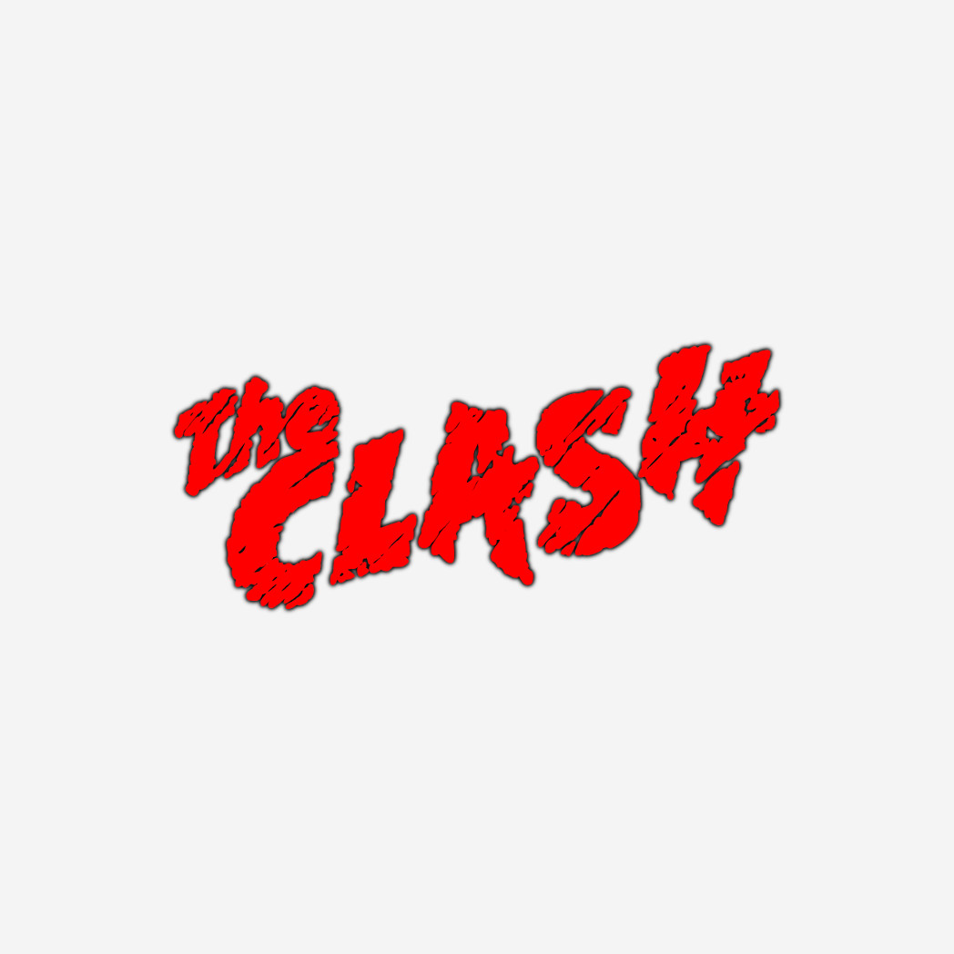 The Clash graffiti style logo
Matching their band name, The Clash’s logo features a chaotic typography style. The design incorporates incomplete and roughly colored strokes, embodying the rebellious and “don’t care” attitude central to punk rock.
More Rocking Logos for Inspiration
The list of iconic rock band logos is extensive. Here are more examples to fuel your design inspiration:
Guns N Roses
Weezer
 Weezer W logo
Pearl Jam
The Strokes
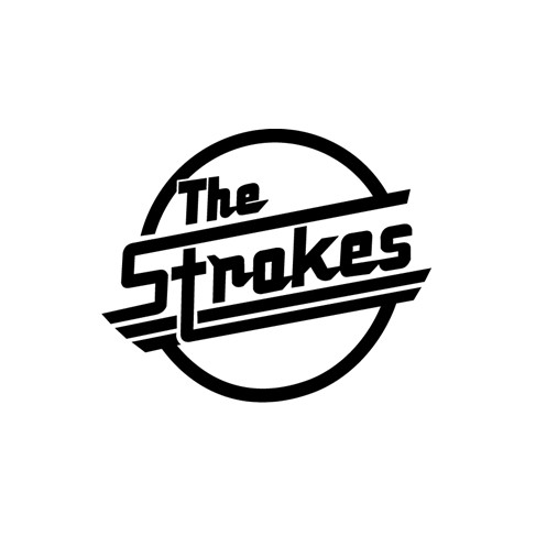 The Strokes text logo
Anthrax
Korn
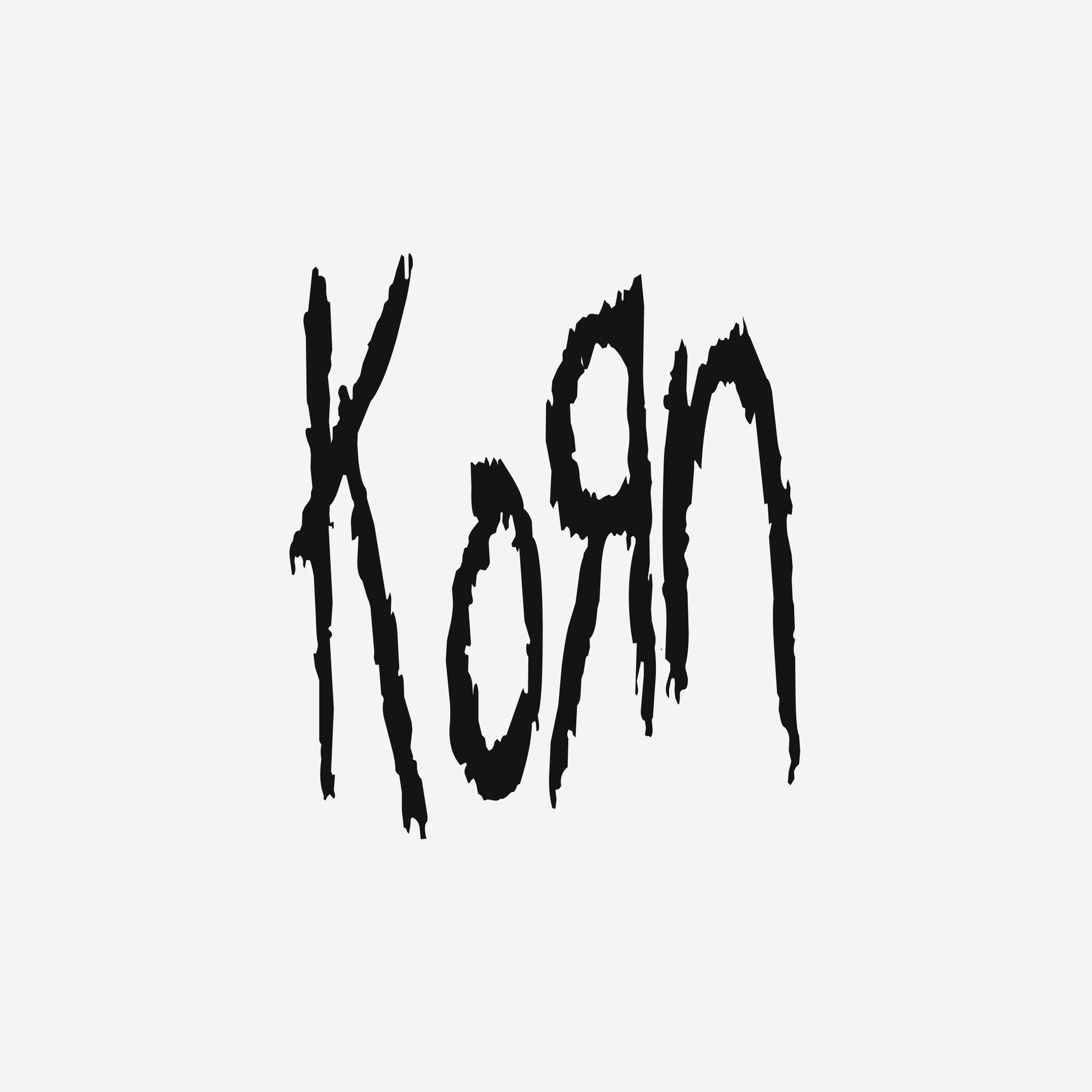 Korn backwards R logo
Radiohead
Yes
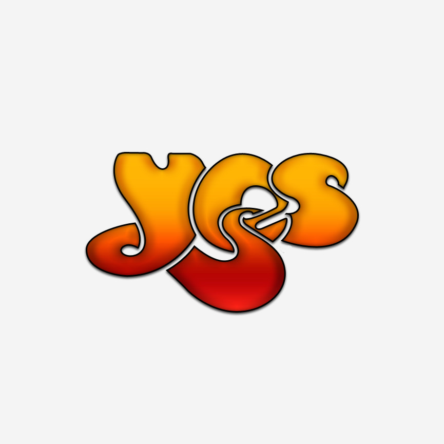 Yes bubble letters logo
The Killers
Van Halen
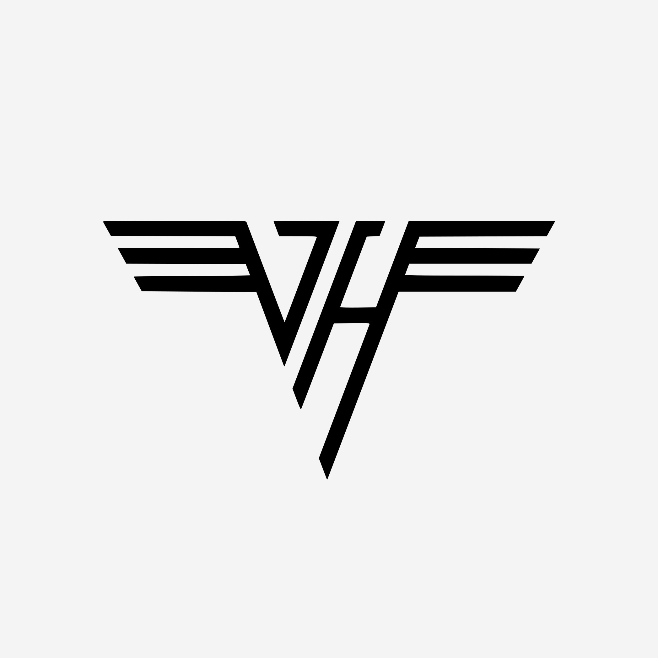 Van Halen VH logo
System of a Down
Blink 182
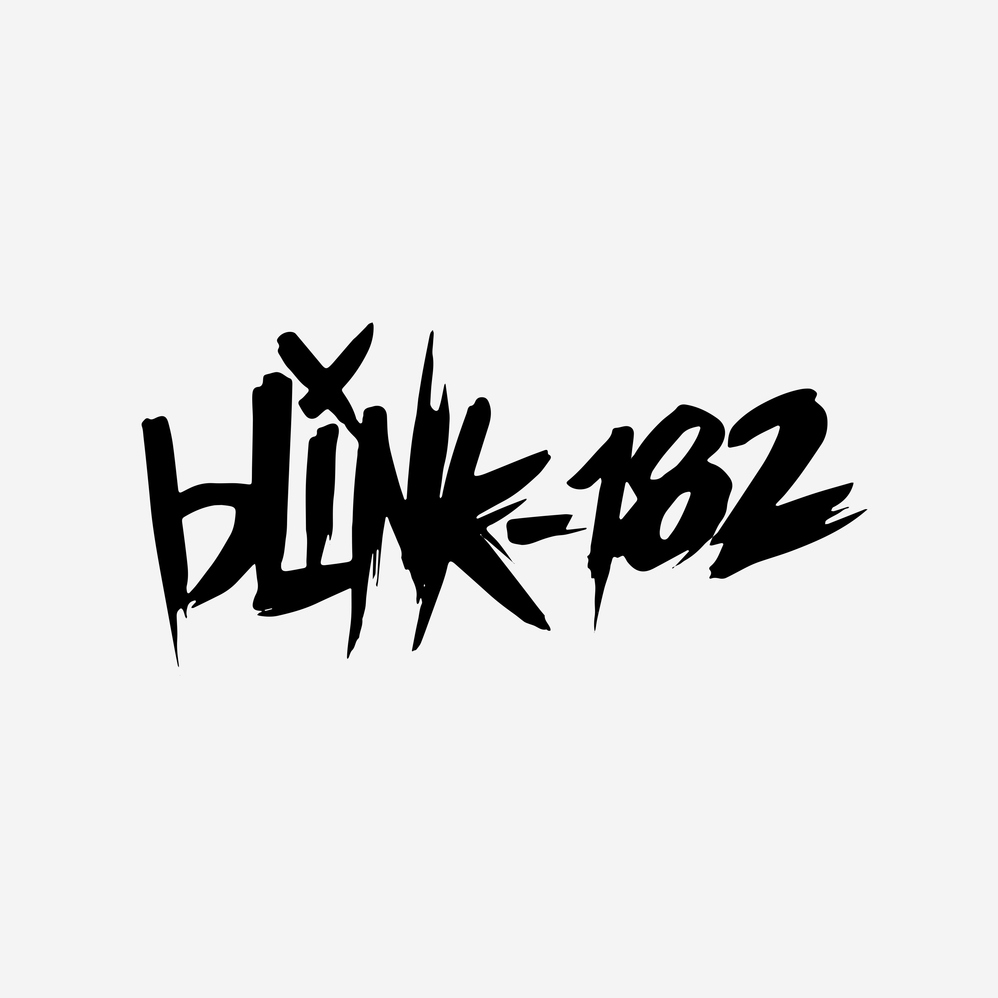 Blink 182 six arrow logo
The Smashing Pumpkins
Misfits
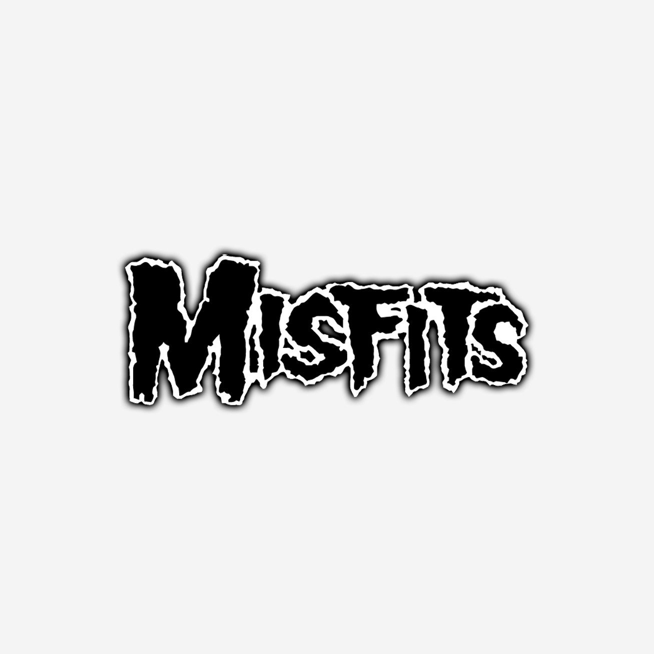 Misfits skull logo
KISS
The Grateful Dead
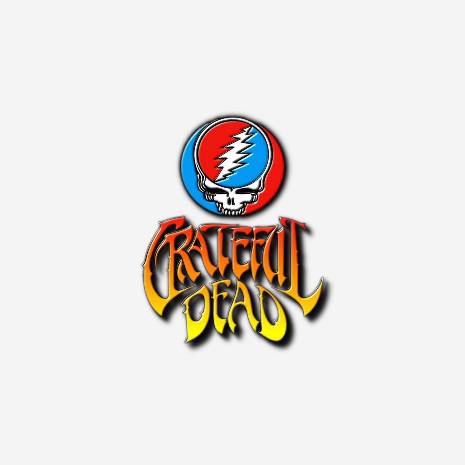 The Grateful Dead skull and roses logo
The Libertines
My Chemical Romance
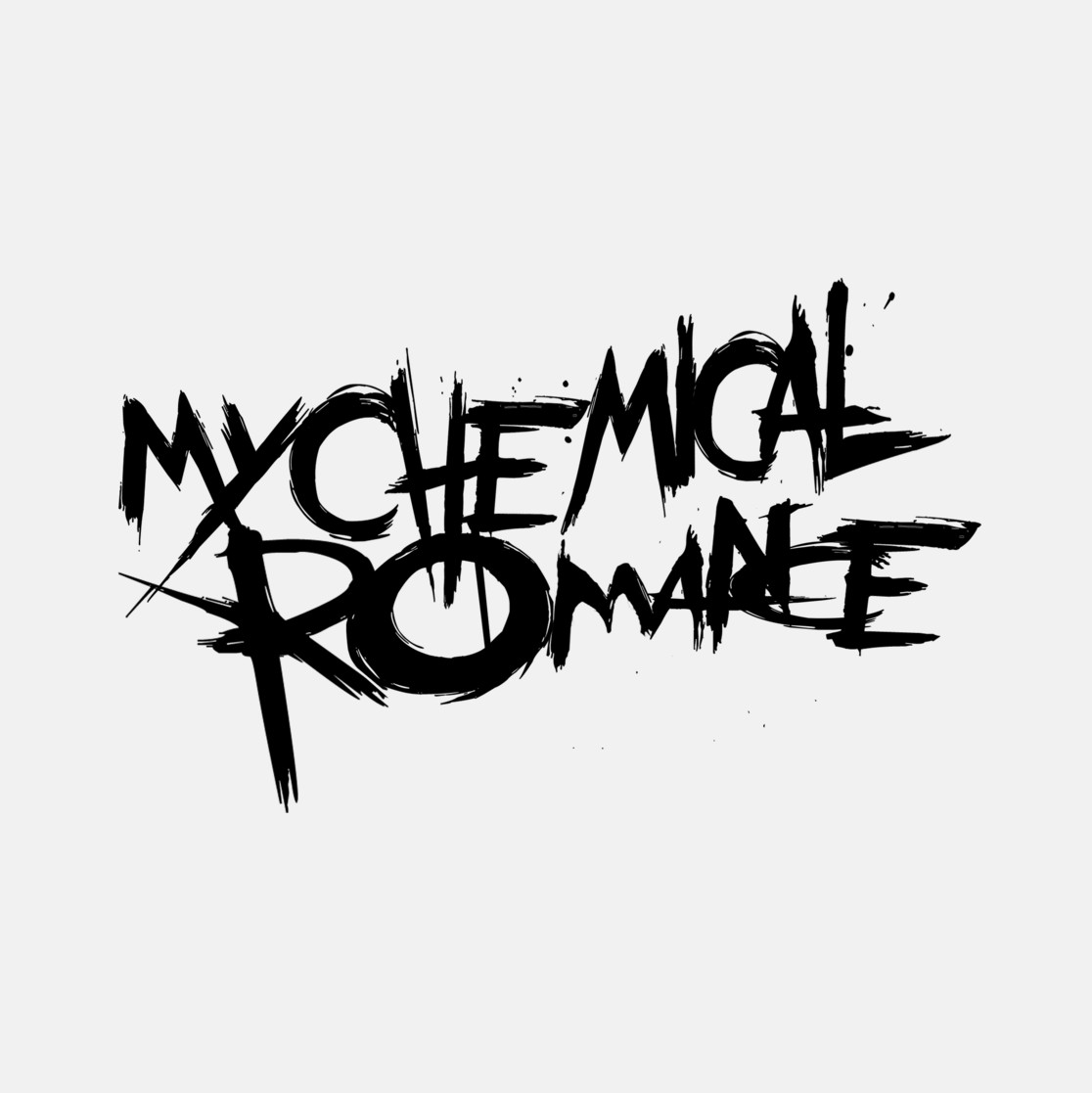 My Chemical Romance MCRX logo
ABBA
Sex Pistols
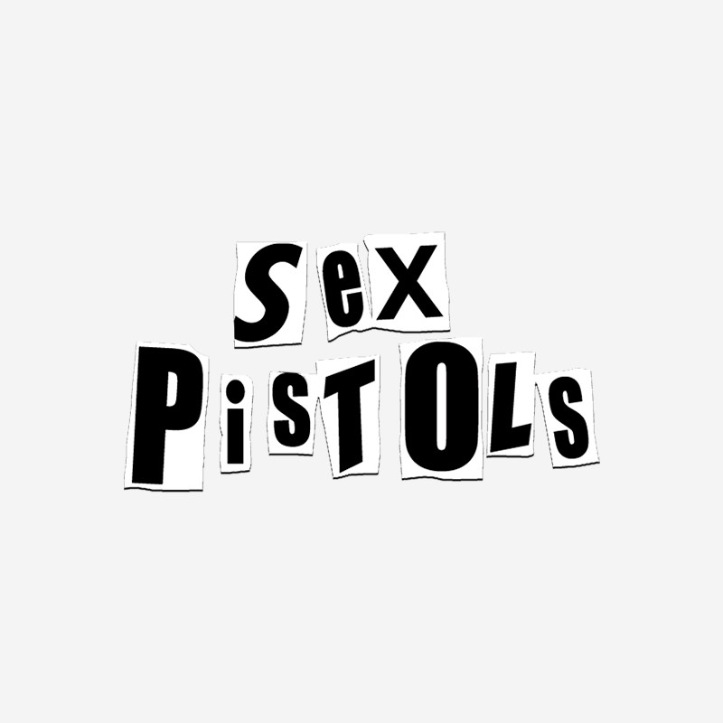 Sex Pistols cutout letters logo
Queen
Iron Maiden
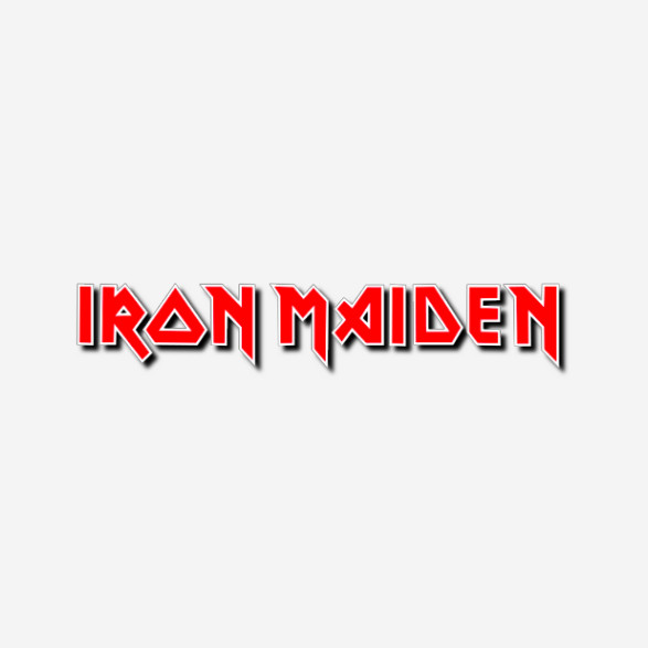 Iron Maiden Eddie logo
NIN
The Cure
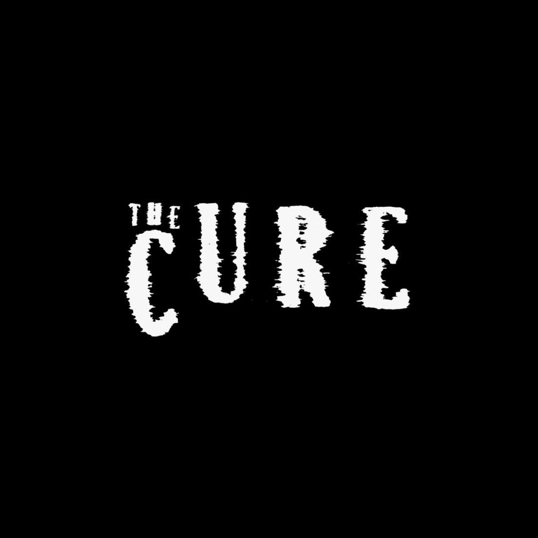 The Cure text logo
The Smiths
Wu-Tang Clan
 Wu-Tang Clan W logo
Led Zeppelin
Pixies
 Pixies P logo
Fall Out Boy
Yeah Yeah Yeahs
 Yeah Yeah Yeahs YYYS logo
Avenged Sevenfold
Kings of Leon
 Kings of Leon KOL logo
The Script
Rage Against the Machine
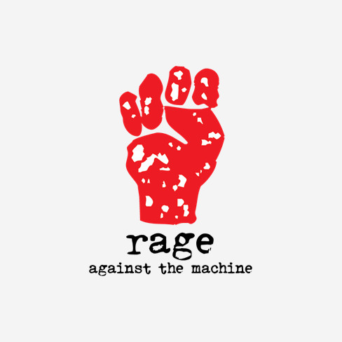 Rage Against the Machine star logo
Slipknot
The Kinks
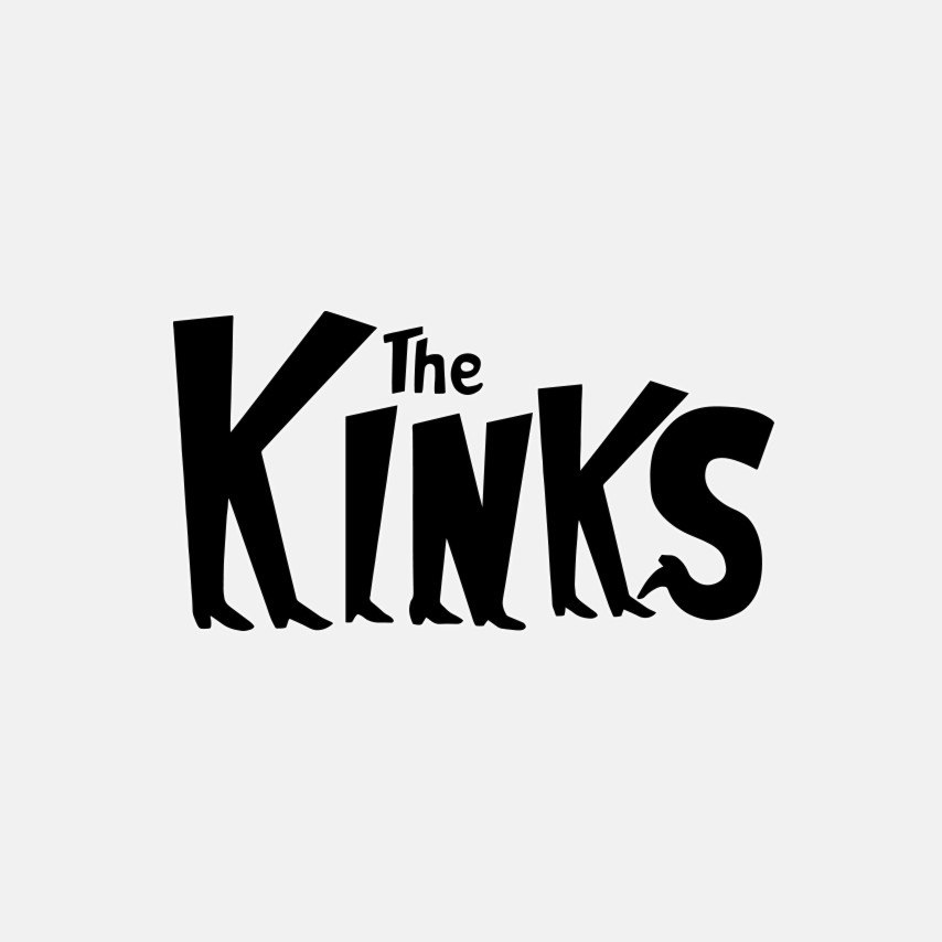 The Kinks text logo
Arctic Monkeys
Gorillaz
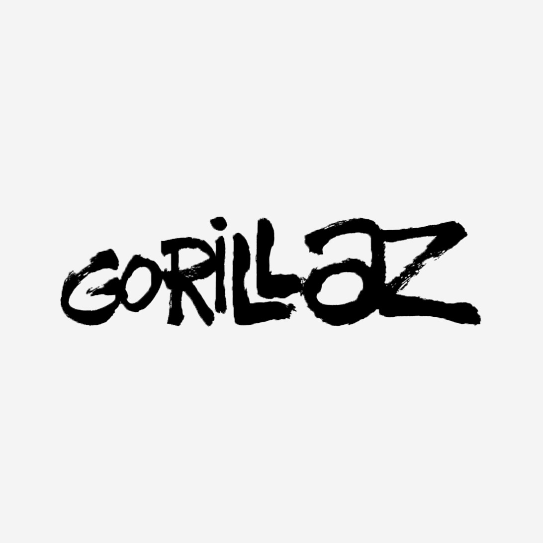 Gorillaz G logo
Foo Fighters
Black Sabbath
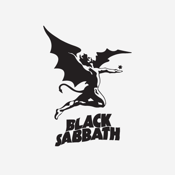 Black Sabbath cross logo
We hope this exploration of rock band logos has sparked your creativity! Consider the elements that make these designs so memorable and try incorporating those insights into your own logo creation. Experiment with customizable logo templates and design tools to bring your vision to life. Once you’ve perfected your logo, showcase it in an online portfolio to impress potential collaborators and fans.